Grade.us has one of the most robust and customizable review management platforms available.
Whether you're a marketer, SEO specialist, marketing agency, or large enterprise, review management has become an essential marketing channel for customer acquisition and valuable tool for evaluating customer satisfaction and experience.
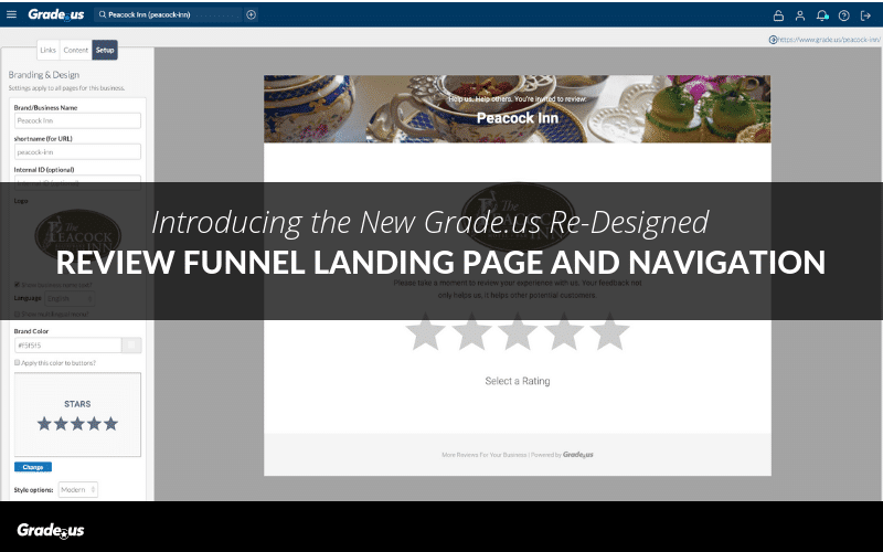
Watch the webinar below that we held on Friday, February 15th, which showcases the new review funnel landing page.
The team at Grade.us has been hard at work improving our navigation and review funnel landing page for a more modern design that matches the sophistication of our customers (without losing the ease-of-use functionality that differentiates from other software in the space.)
So let's take a look at what's changed.
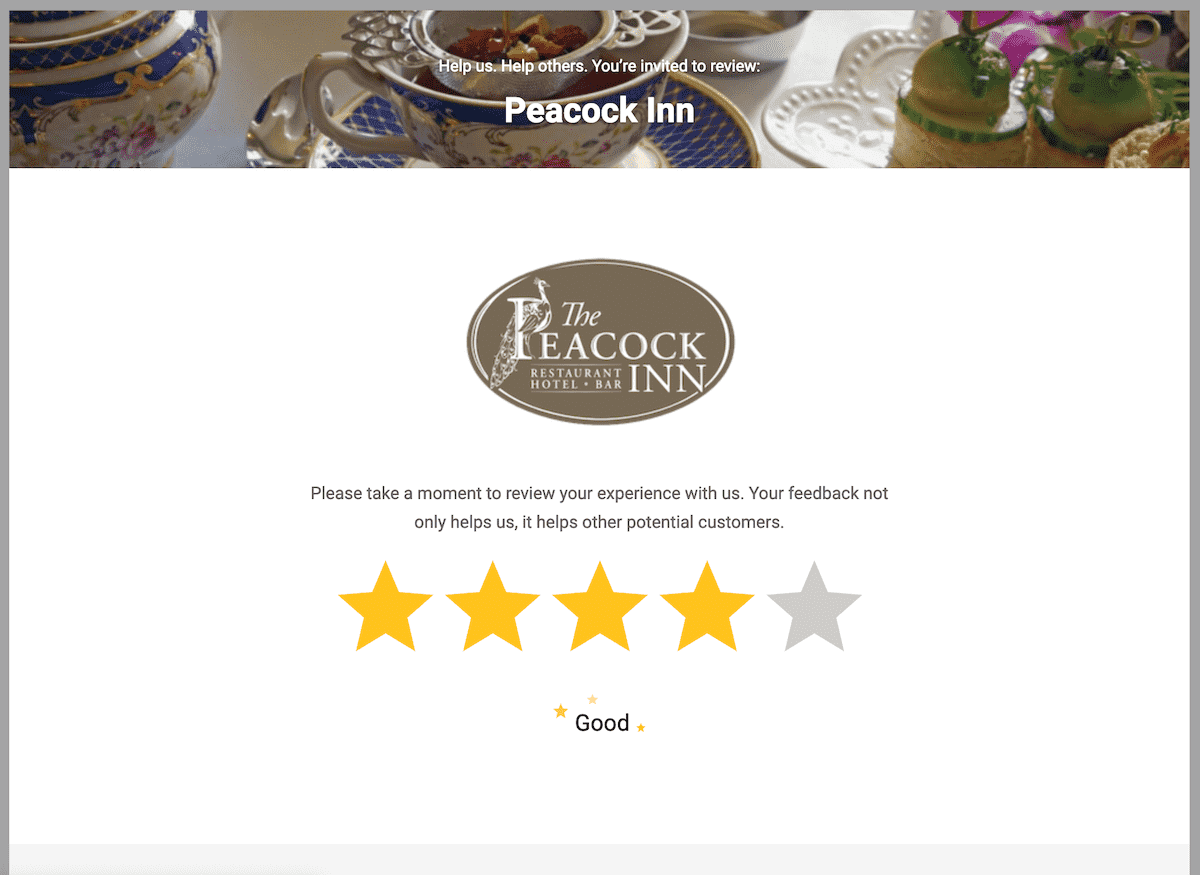
Introducing Our New Landing Page
First, please note: the existing landing pages for Grade.us customers still use the Classic design unless and until they opt-in to the new design.
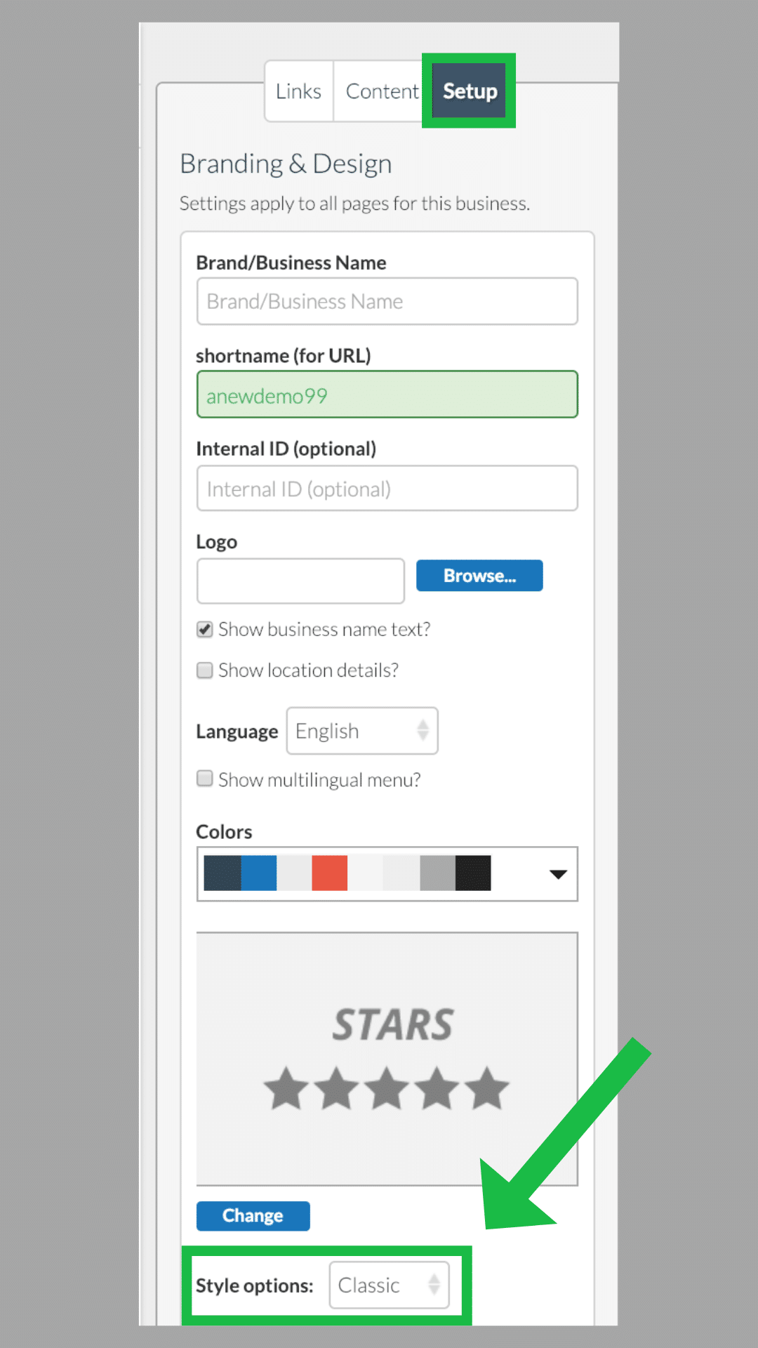
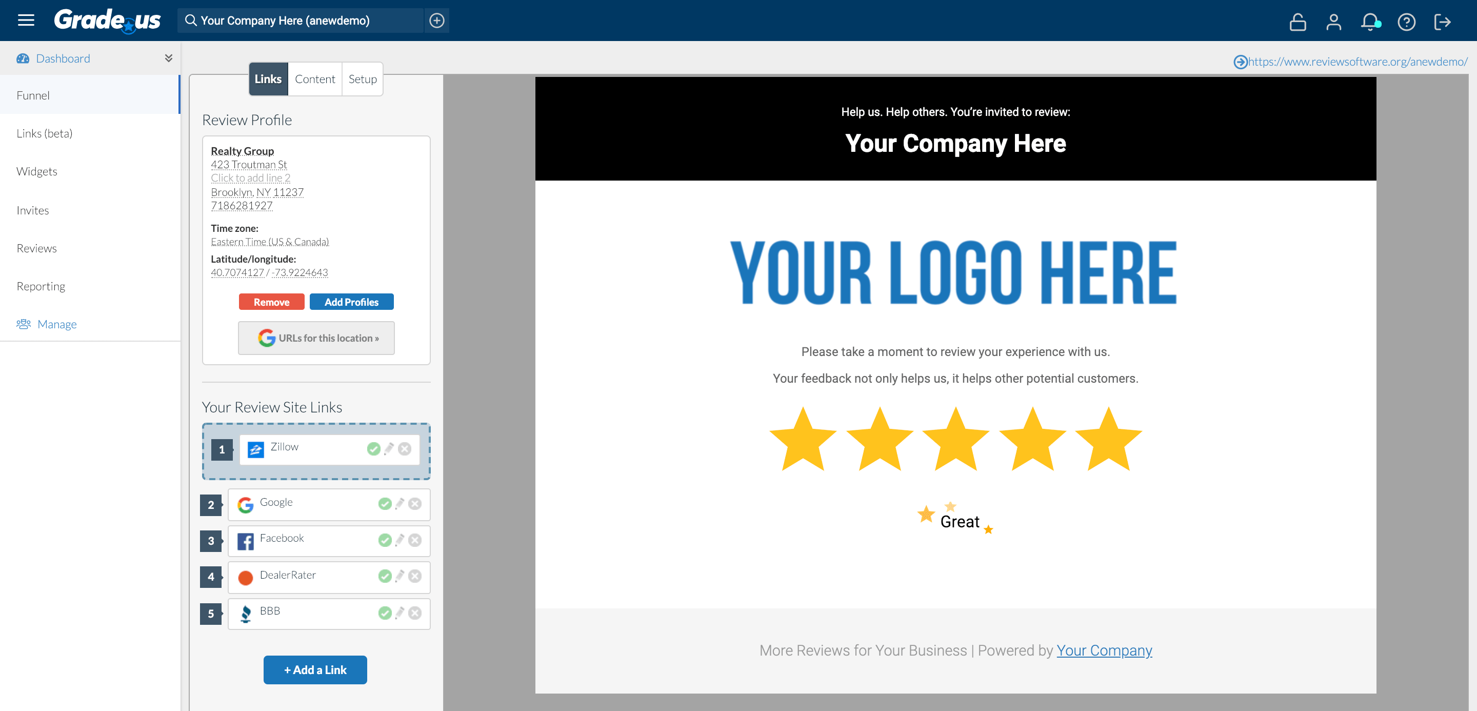
To change a profile over, go to:
Dashboard > Funnel > Setup > Style Options and select Modern.
You can switch back anytime by selecting Classic.
This update is largely a cosmetic re-skin, with most elements of the landing page staying and functioning the same, but with new, contemporary styling.
That said, there are a couple of new features that we’re excited to share.
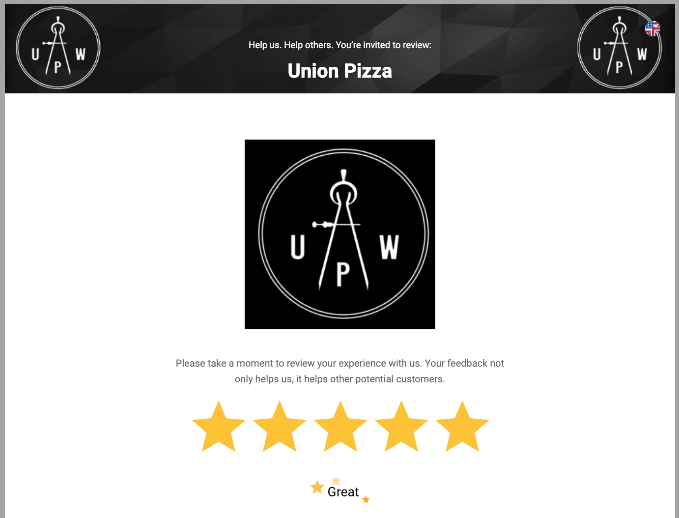
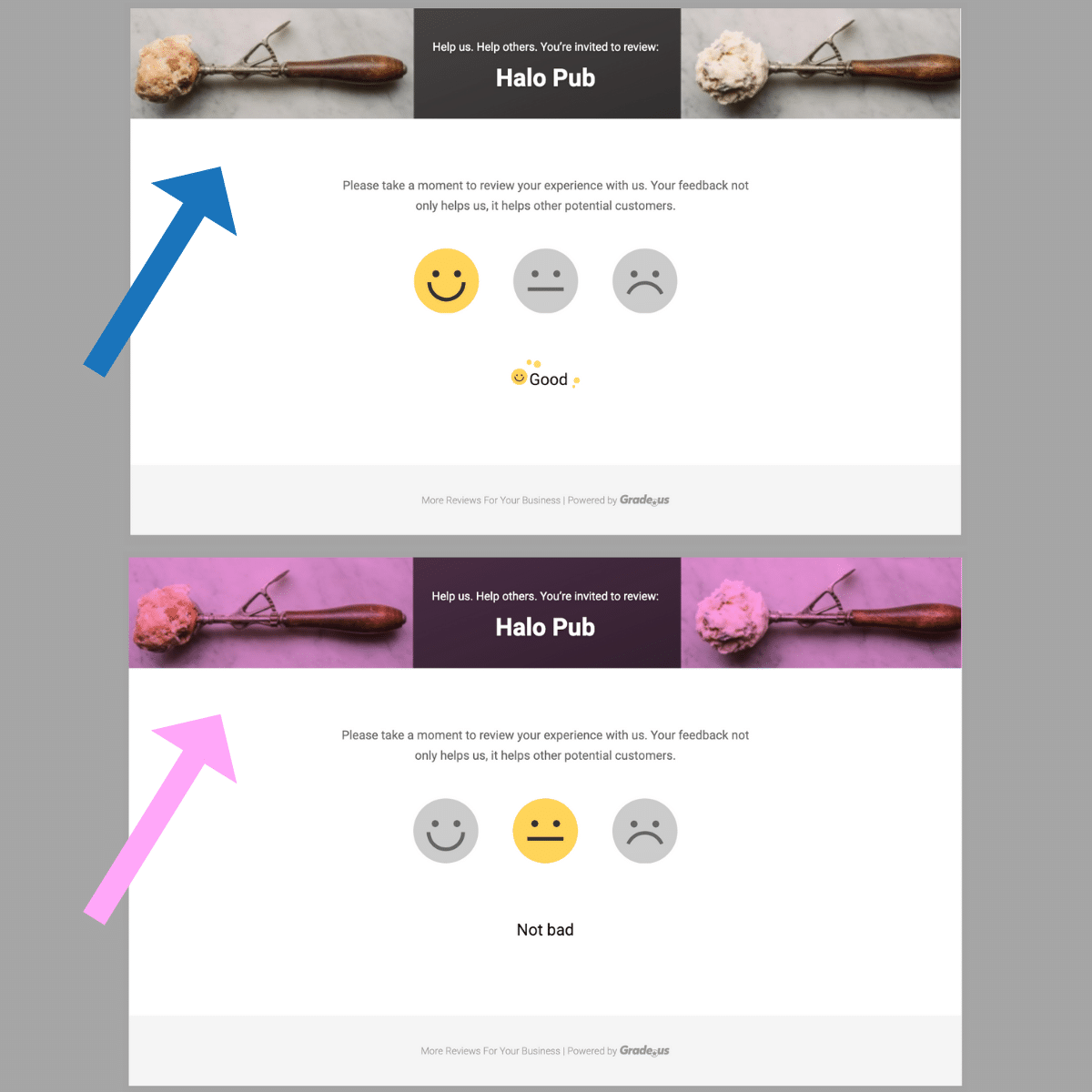
Page Header and Header Image
To add more out-of-the-box customization options, we’ve introduced a new page header and optional “Header image” feature that allows you to add a colored banner or banner image to your landing page. Banner images should be:
When creating a header, we recommend either using photoshop or Canva. If you use a free tool (like PicResize or ResizeImage), try to find an image that's larger than the 1024 x 138px and then crop it to fit the dimensions.
If you try to simply enlarge a smaller image to fit the dimensions, it will look distorted. For sourcing royalty free commercial images, we recommend Pixabay or Unsplash.
If the size of the file is too large, you can use a free resource, like Online Image Compressor, to make it small enough for upload.
If you have selected a brand color and uploaded a header image, you can optionally apply the brand over your header image as a transparent overlay by checking the 'Apply this color to buttons and graphics?' box in:
Dashboard > Funnel > Setup.
Brand Color
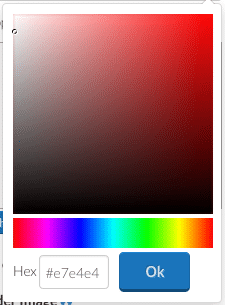
The new Brand Color option allows you to choose any color you’d like for the new page header (and optionally, your stars/faces/thumbs), via a built-in color picker that lets you input a hexadecimal color code or simply click and drag until you find a color you like.
One Consideration:
We have not modified any custom CSS when we switch a profile over. Therefore, customers will likely need to modify and thoroughly test their CSS for any profile they switch over.New Top Bar Navigation UI
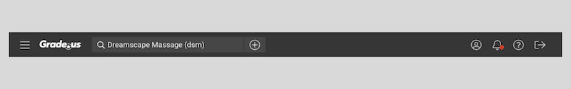
In coordination with our recent focus on modernizing our landing page, we have updated the Grade.us platform navigation.
With the re-designed navigation, all of the functionality will be exactly the same as it always was on Grade.us. Customers will now be able to access their account, notifications, and support (with resources in a sub-menu) via the icons at the top right of the platform.

Users will still be able to navigate between profiles via the search bar at the top left corner. They will now see a + sign icon which will allow them to add their new businesses.
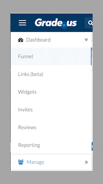
New Side Menu Navigation
The main review funnel, links, widgets, invites, reviews, and reporting tab, along with your manage and brand menu options, will be available on the left side menu (via the hamburger icon).
Our plan is to continue to update the design of the rest of the platform over the next few months. We're excited to provide a beautiful, fully modernized platform in the near future.
White Label Logo Implementation
Our reseller and white labeled agency and brand customers will also have their logos seamlessly transitioned over to the dark gray background, as displayed above.
Any thoughts? Feedback? Comments?
We're very excited about this update, and would love to hear any other thoughts on the new changes in the comments below.
For any technical questions or general support, please email us at [email protected]
Want to take the new landing page for a spin?
Schedule a demo with one of our team members today!
Schedule a Demo