You've done it! You provided 5-star service, and helped Prince Charming and Snow White (or, you know, Princess Charming and Snow White, or Prince Charming and Stan White) find their happily-ever-after. You deserve a great review.
But if you're not paying attention to your profile on major review sites, your reviews might never get seen. Worse, you might never get seen.
Some people use these sites exclusively to find the wedding providers of their choice. And they use your profiles on these sites exclusively, too. Many of the people who find your company via The Knot or Wedding Wire will never click through to your website. They might call you on the spot.
They might also move on, if they don't like what they see.
So let's make sure you don't get passed by!
Listing Advice for Any and Every Review Site (Majors and Wedding Industry Specific)
Some advice works well for all sites.
1. If a site gives you a field to use, then use it. Try not to leave anything blank.
2. Try to make your business description as compelling as possible. This is your chance to put your best foot forward.
3. Use every photo, 3D Tour, and video opportunity you're allowed. If the site lets you post nine photos? Post nine. If it lets you post 95? Post 95.
Put as much effort into your profile as you'd put into your own website.
The Knot
As you probably already know, The Knot is the single most important site in the wedding industry. Here's how to nail your profile there.
Pay close attention to photo #1.
The very first photo you upload to The Knot will serve as a sort of cover photo for your entire listing, so make sure it's the most attractive photo you have.
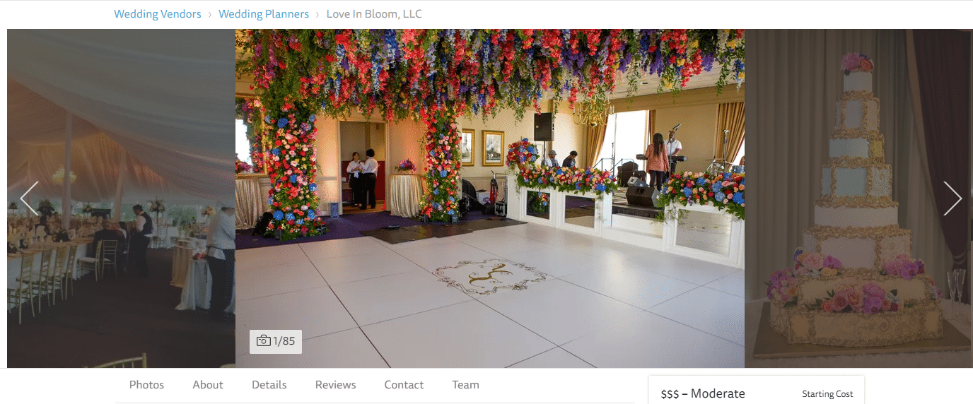
The bright, colorful flowers are both visually striking...and a nice call out to the name of this business (Love in Bloom).
Customers will be able to scroll through all your photos right at the top of your page, but they probably won't if that first one doesn't blow them away.
The devil is in the details (section).
The details section is the place to share bullet points about everything your company does.
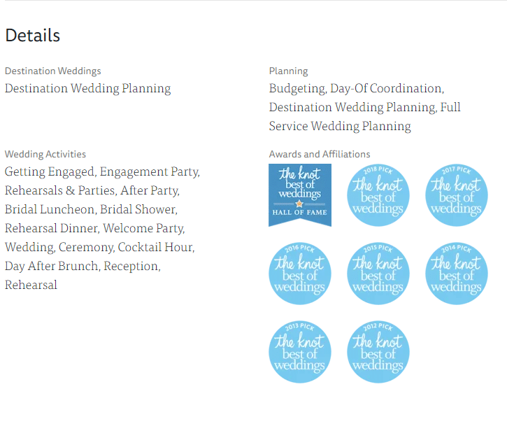
Make sure you add every last thing you do, because customers are likely to skim this section before moving on to the full business description. If they don't see the one thing they're looking for, they'll move on.
Do this even if you think what you do is pretty gosh darn obvious.
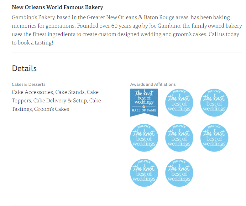
Sure, we can make an educated guess your world-famous bakery does wedding cakes if it's featured on a wedding planning site.
But this profile raises some questions.
It says Groom's Cakes. But not Bride's Cakes. Does that mean we'd have to go elsewhere for the Bride's Cake? Probably not...but a couple who is planning a wedding is super stressed out. Leaving any question or any uncertainty in their minds is a good way to get passed over in favor of someone else.
So here's your rule of thumb:
When in doubt, list it out.
Make sure the "Meet the Team" section is working for you.
Weddings are about people. Those who are planning a wedding aren't looking for the best company to work with so much as they're looking for the easiest people to work with.
"Meet the team" helps you transform your company image into something a little more personable.
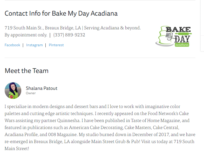
Wearing the Food Network competitor's uniform in this shot is a particularly nice touch.
By the way, this section may reveal you're a one person show, but that's okay. You're hardly alone. Besides, the way The Knot sets up their profile lets you put an end to the age-old "we" vs. "me" dilemma when you're a solopreneur.
Up top it's "we," down in the team section it's "me," and it all works out just fine.
Funnel as many reviews here as possible.
You may have noticed all the Knot awards in the "Details" screenshots above. To qualify for these awards you must have at least ten reviews posted that year. The better the reviews the more likely you are to win. A higher quantity of reviews also increases your chances.
These are great awards to put on your website as well as your profile. The Knot estimates people who win get three times as many leads from their profiles as those who don't, which is a huge plus.
Need more clients?
Whether you're a planner, photographer, florist, or any other specialist, the wedding industry is competitive . Getting online reviews can help you one up your competition.
That's where Grade.us comes in.
Create your review funnel today for free and start giving your happy brides and grooms a voice!
Help them share the love.
Wedding Wire
Some of Wedding Wire's setup is very similar to The Knot's.
For example, the first photo you upload here will again serve as the first one customers see when they look at the carousel at the top of the page. It serves as a sort of header, so choose wisely.
But Wedding Wire isn't a copycat. It's got plenty to finagle that you won't see on The Knot. Here's how to make the most of your options.
Format wisely.
Wedding Wire gives you lots of room to write your About section, and allows plenty of formatting options such as bullet points, bold headers, and spacing.
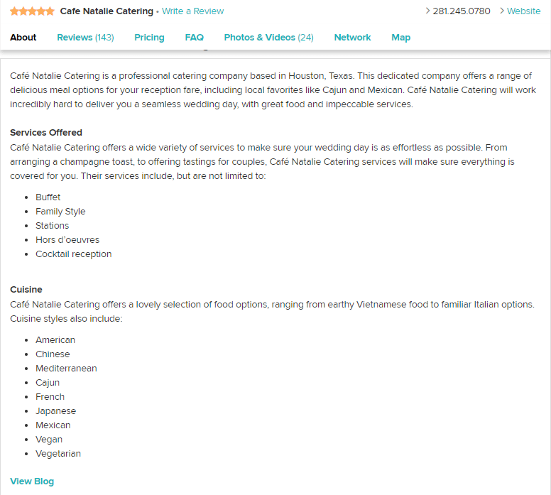
This is a great opportunity to create an at-a-glance vision of what your business does. It's also nice to look at something other than a big, intimidating block of text, which is what you get on most review sites.
Is the price right?
WeddingWire lets you put your pricing right on your listing. Please don't be afraid to do this. I know you don't want to scare off any prospects. But the truth is when you post your pricing you avoid wasting their time and yours. If they can afford you and like what they see, they'll call. If they can't, why do you want to talk to them anyway?
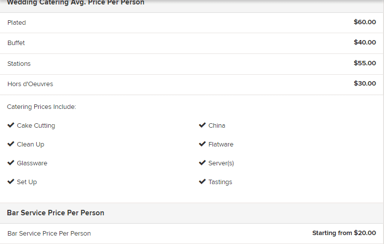
The great benefit of the internet is the ability to get information fast, without having to waste a lot of time on the phone. You know price is one of the first questions you normally get anyway. So answer it. Everyone is happy. There's nothing to be gained by playing coy.
Don't slack on the FAQ.
Since we're on the subject of the questions you get all the time let's talk about Wedding Wire's FAQ section. You'll want to take full advantage of it. Don't worry, you can customize it to your business type.
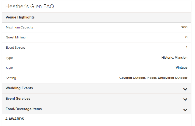
Can you imagine how useful this at-a-glance info is to a busy, stressed bride or groom? And, again, it keeps both parties from wasting their time.
If I need space for 400 guests, I know not to call this provider.
You don't waste your time having a 20 minute conversation with me only to learn I've buried the lede on the matter of the 200 extra guests you are unable to accommodate.
Seek professional network endorsements.
Wedding providers often work together. This section lets them talk about each other, separate from the customers who are reviewing the business. Want to convey to wedding planners you're not going to give them any headaches? This is the spot to do it.
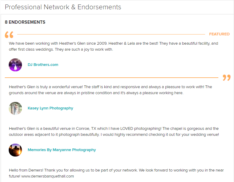
Of course, to make the most of this section you'll have to make a personal ask of other companies you work with on various weddings. You'll also have to be willing to offer your own endorsements, so don't ask anyone you wouldn't be proud to endorse yourself.
Most of the tips I gave you in the "General Tips" section apply to Google My Business. There aren't a lot of special sections here to worry about, so I'm just going to give you a brief checklist.
- Make sure all your information is 100% correct, and that it matches the information you’re posting on other sites.
- Google allows videos as well as photos, so make the most of them.
- Use GMB’s “Offers” feature to good advantage. If you’ve got a nice discount running it might just get you the call.
- Make sure the photo that’s showing up in the initial maps listing is a really pretty one.
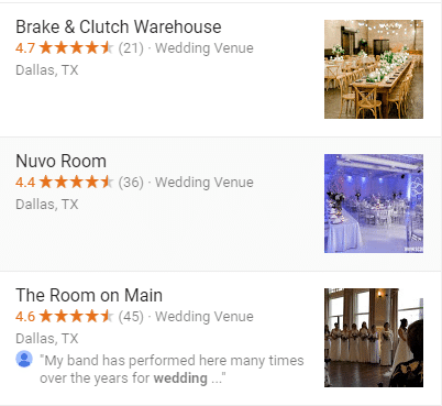
Good, best, meh. The Nuvo Room's photograph stands out. The magical lighting and beautiful colors pop off the page. Brake and Clutch has a decent photo. The Room on Main gets the 'meh' rating. We can't tell much about the venue by looking at someone's random wedding party, and the photo is really dark.
Remember your showcase photo is going to appear first in thumbnail form. Double check it to make sure it looks great. Wedding planning is a visual art!
A lot of families do at least 80% of their wedding planning by sharing a bunch of ideas back and forth on Facebook. So while it's not exactly a wedding-exclusive review site, it's probably one of the most important web properties for you to knock out of the park.
Good news? Facebook pages have gotten pretty sophisticated over the years, offering some pretty cool options for putting your best foot forward.
Use a slow-moving video as your page header.
It should probably be a silent video (nobody likes sudden, unexpected music, and this thing auto-plays). Don't let it go so fast it sears your prospective customer's eyes out or makes them dizzy. But using video this way is a nice, professional touch.
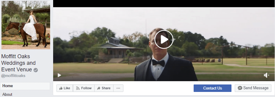
While you're at it, make sure the smaller picture to the left helps convey what makes your business special.
A pretty "About" post will stand out.
You can leave this right at the top of your page's feed. When customers click to read more they can see something like this.
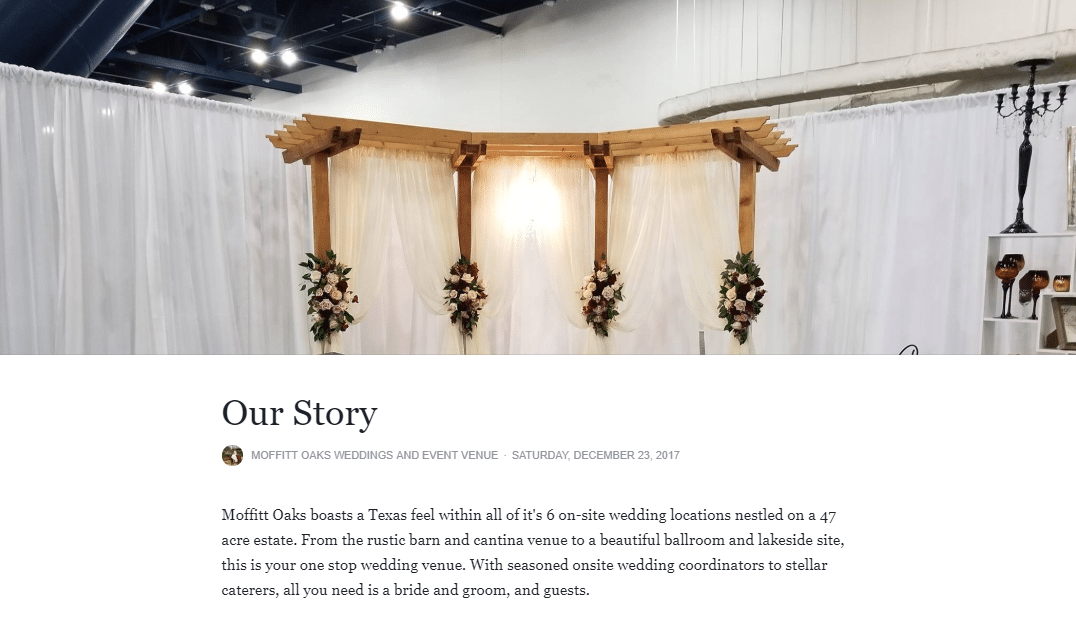
This post is enticing, beautiful, and succinct. You instantly know what's special about this venue.
Stay current, stay social.
Don't forget Facebook is a social site. You need to put up at least one new post a week.
Here are a few ideas:
- Photographs from your venue.
- Shares on other great non-competing vendors nearby.
- Tips on how a person planning a wedding can make their own lives easier.
- Any recent news about your company you’d like to share.
It's better if you are posting something two or even three times a week, but make sure you don't go idle.
You also want to pay close attention to Messenger. People will try to contact you and book with you via Facebook. Make sure someone is checking those messages every day.
Give Facebook the same level of attention and seriousness you'd give to manning your phones. This is the Age of the Internet. Some of us genuinely are not into making phone calls if we can help it. A lot of people would love to be able to plan their entire wedding with their keyboard. Make it easy on them.
Communicate, interact, and comment on things people post on your page, including reviews. It makes you look open, attentive, and friendly. It also tells people you know what a social media site is for. Equally important.
Don't get overwhelmed!
Claiming all these web properties can feel like a real pain. It takes time to write the descriptions, to upload tons of photos, and to deal with the different set-ups on every single site. Resist the urge to race through the process. It may take awhile to create beautiful profiles, but each one of them represents some of the best free advertising you're ever going to invest in.
If you give these profiles some love by giving them the attention they deserve, they'll give you some love by giving you the leads you deserve.
Need more clients?
Whether you're a planner, photographer, florist, or any other specialist, the wedding industry is competitive . Getting online reviews can help you one up your competition.
That's where Grade.us comes in.
Create your review funnel today for free and start giving your happy brides and grooms a voice!
Help them share the love.
About the Author
Raney C. Hudson
Raney C. Hudson is an independent content consultant with a 10+ year track record in the digital marketing industry.


